Kanpai 'Til You Can’t!
TaKe Izakaya new logo and visual identity
Brand New

No items found.
No items found.
No items found.

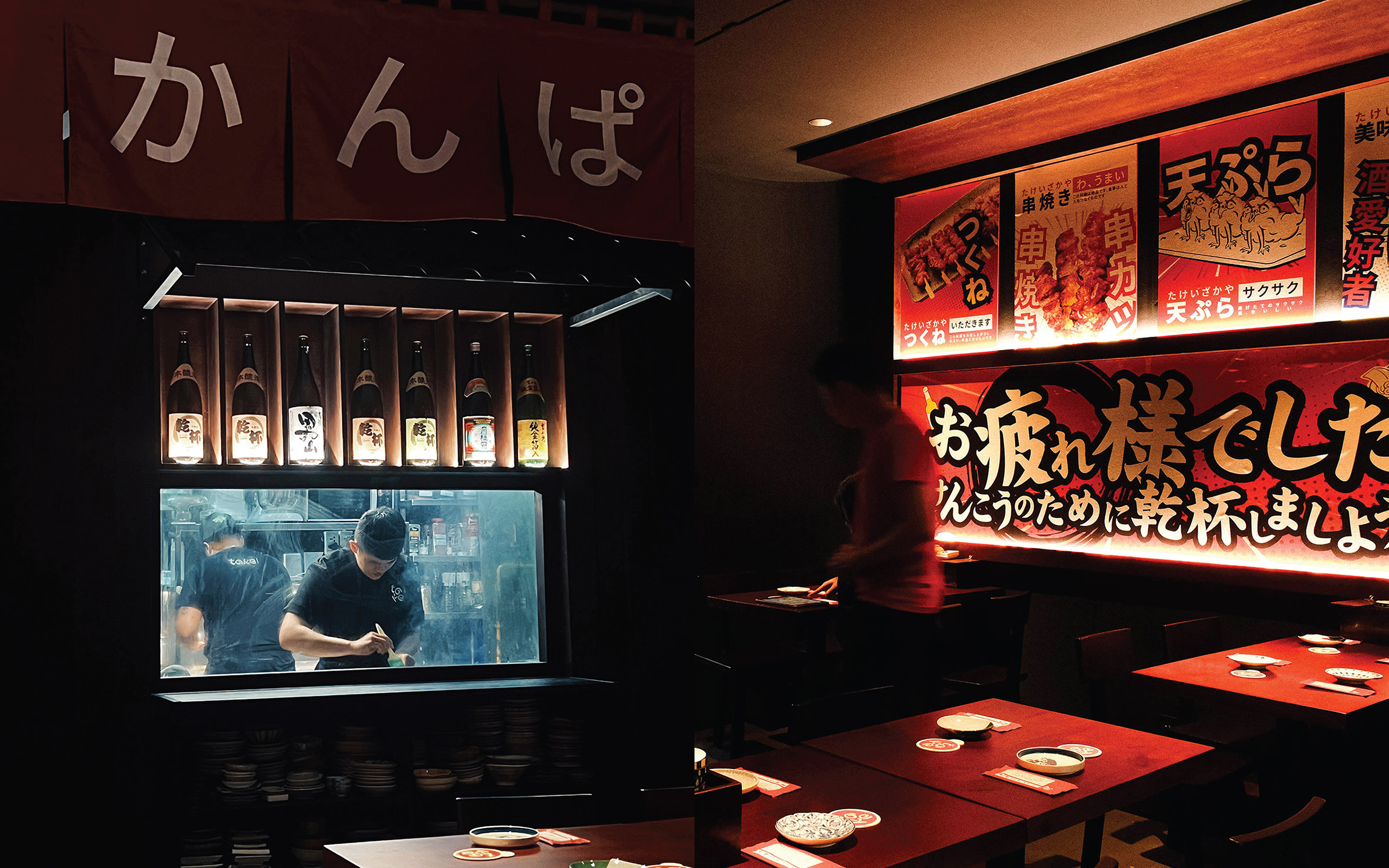
Nestled discreetly within a vibrant alleyway on Đông Du Street, in the bustling heart of Ho Chi Minh City, Take Izakaya offers diners an immersive culinary escape. As a contemporary interpretation of a traditional Japanese izakaya, Take provides a vibrant yet intimate atmosphere ideal for unwinding and socializing. Its inviting design seamlessly combines modern elegance with cozy comfort, creating an ideal setting for friends and family to gather, converse, and celebrate life's special moments.
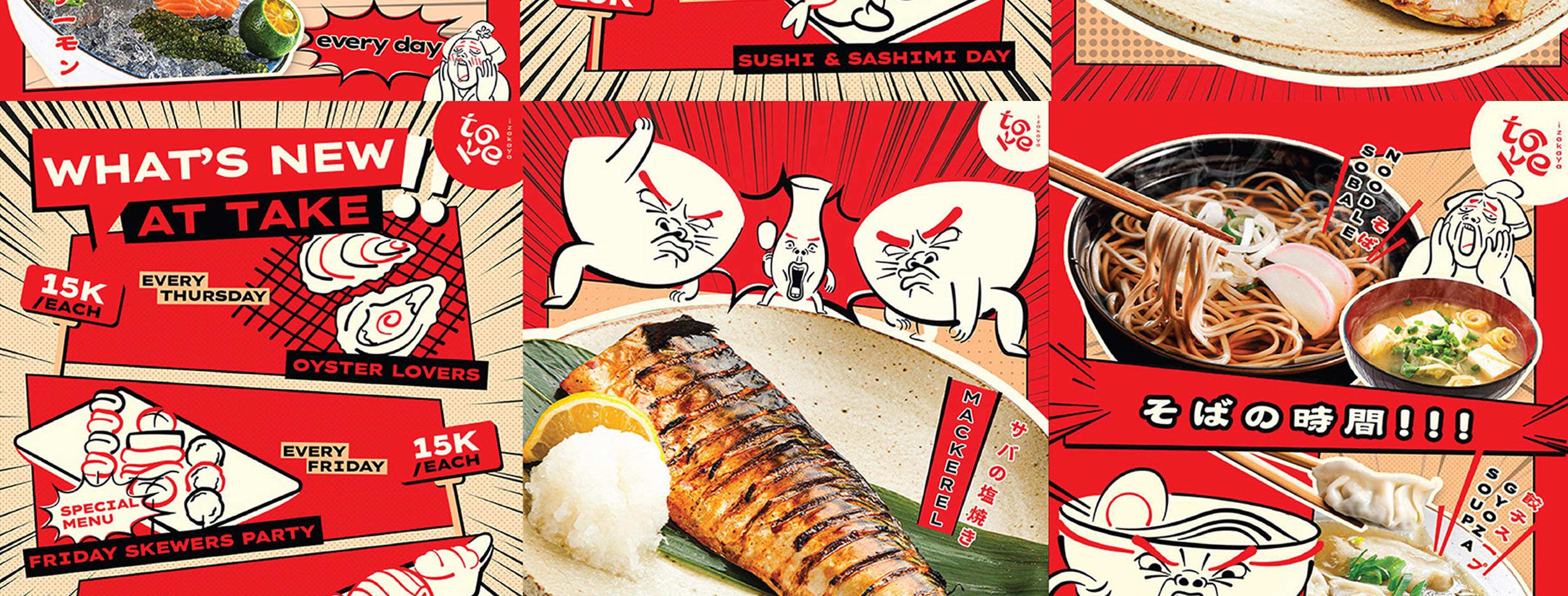
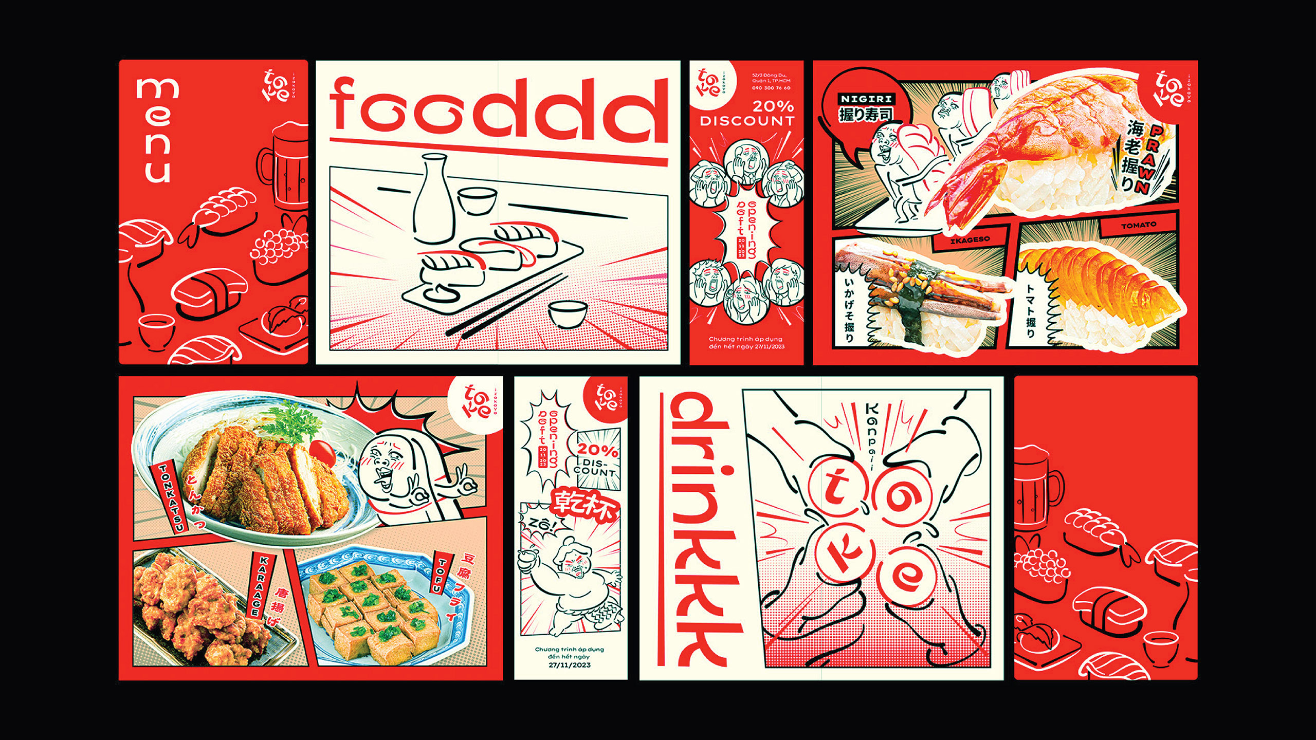
The restaurant's name, "Take," cleverly embodies the philosophy of "Góp Nhặt," meaning "Gathering" in English. This thoughtful play on words symbolizes the harmonious blend of traditional Japanese culinary culture with contemporary Vietnamese influences, creating a unique dining experience. Take’s commitment to this concept is vividly illustrated in its menu, where diners can indulge in an extensive selection of fresh and creatively presented dishes. From expertly prepared sashimi to diverse sushi rolls and succulent grilled specialties, each dish reflects both authenticity and innovation, appealing to a variety of tastes.
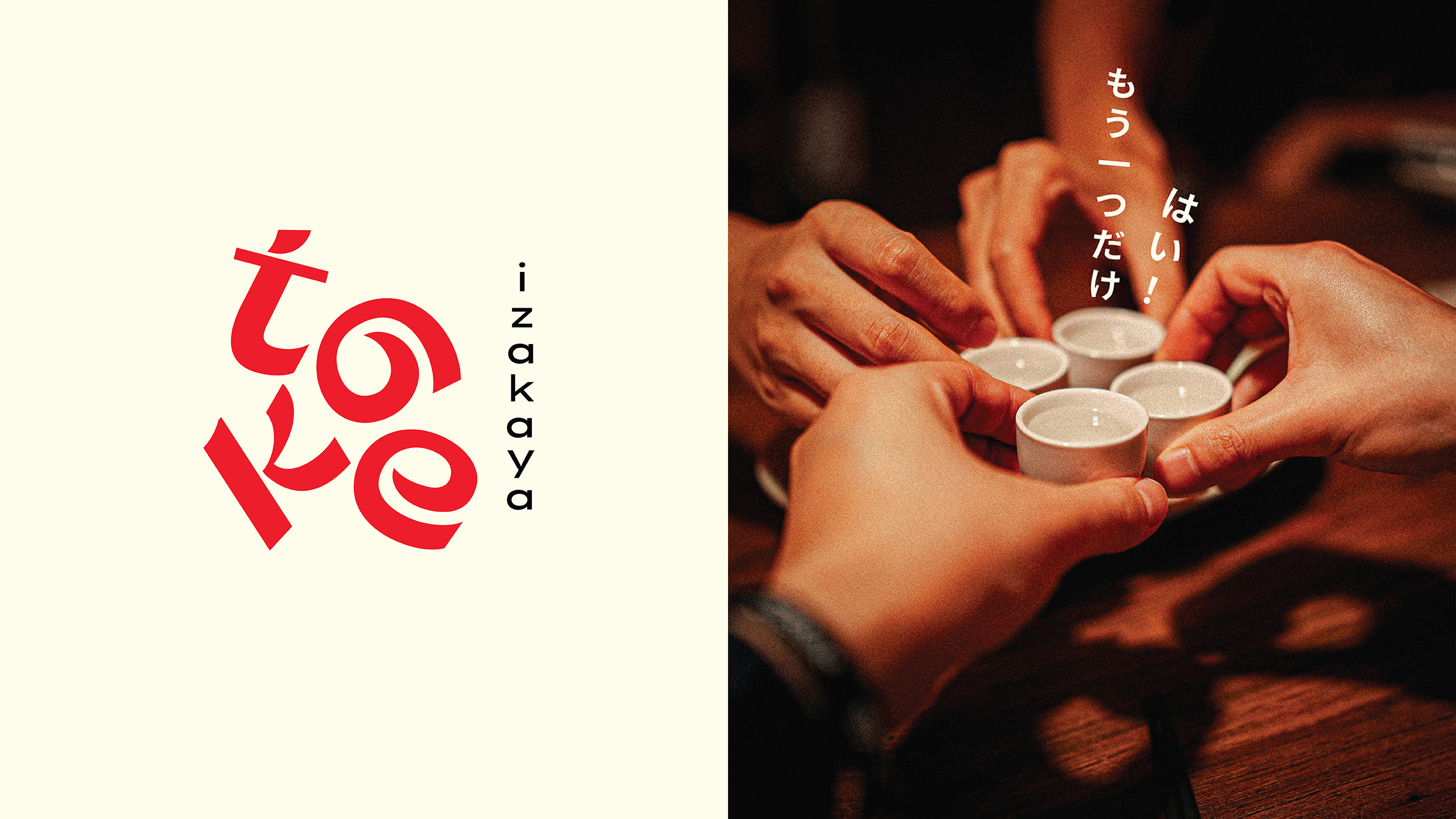
Central to the Take Izakaya experience is the cherished Japanese tradition of "Kanpai," or "cheers," known locally as "123 Yô." More than just a toast, Kanpai embodies camaraderie, celebration, and community spirit. At Take, guests are encouraged to embrace this tradition fully, creating an atmosphere filled with warmth, joy, and genuine connection. Each toast symbolizes shared moments of happiness and fosters deeper bonds among diners, amplifying the communal spirit integral to the izakaya experience.
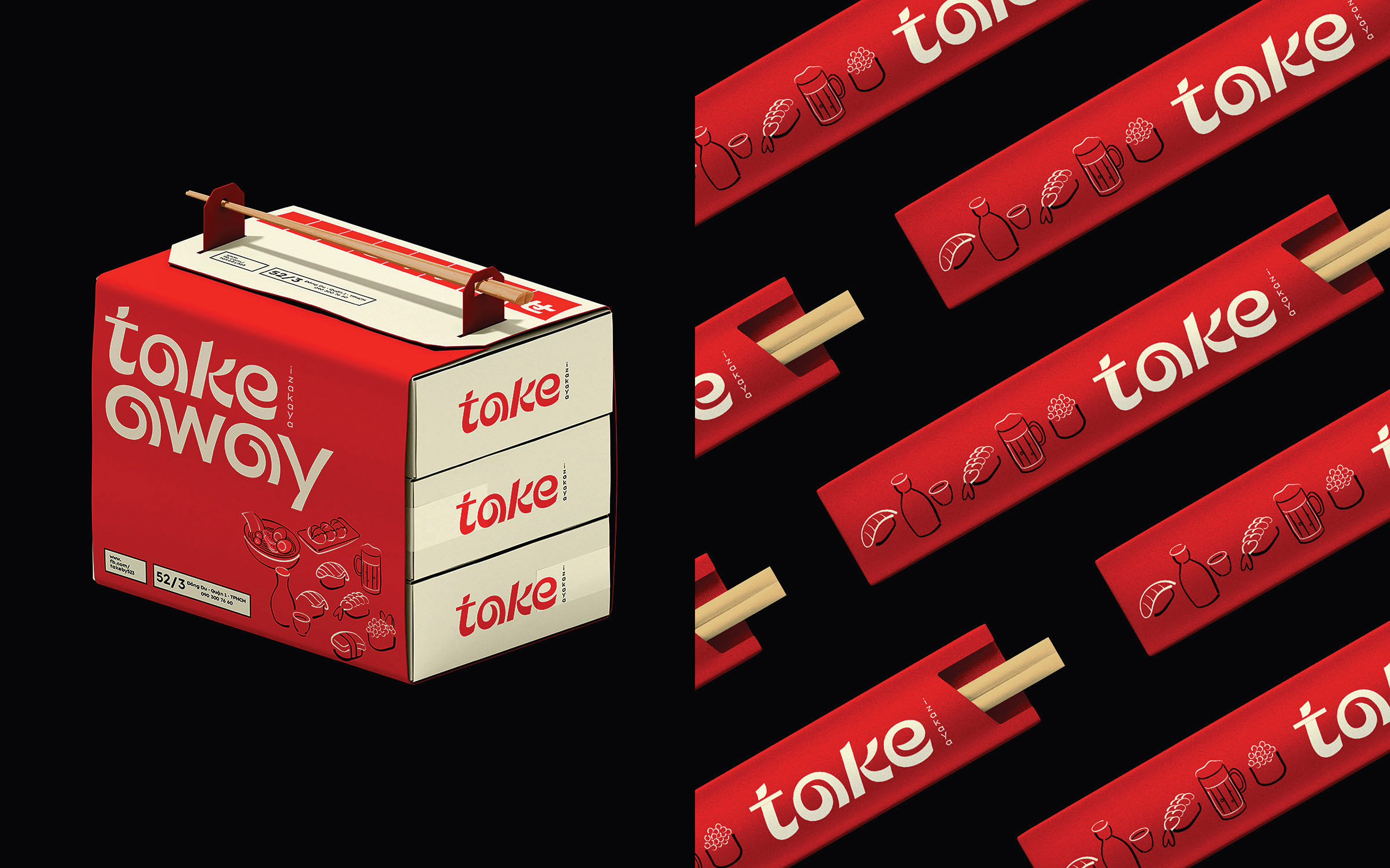
Take Izakaya's visual identity thoughtfully reflects its dynamic and playful personality. The logo utilizes engaging, interactive typography designed to simulate the lively, animated gestures of friends clinking glasses during a "Kanpai." This fluid design emphasizes movement, fun, and interaction, resonating perfectly with the restaurant’s energetic yet relaxed atmosphere. The clever arrangement of letters visually reinforces the idea of gathering and celebration, capturing the essence of the restaurant's brand in a memorable and charming way.
Ultimately, Take Izakaya distinguishes itself through its innovative fusion of traditional charm and contemporary flair. It is more than just a place to dine—it is a social hub where guests can savor exceptional cuisine while enjoying meaningful interactions and joyful celebrations.
By seamlessly integrating elements of Japanese tradition with local Vietnamese culture, Take Izakaya continues to offer an unparalleled dining experience in the heart of Ho Chi Minh City.


