Cultural and community blend
The Local Beans's new logo and visual identity
Brand New

No items found.
No items found.
No items found.


In 2013, not far from Danang's bustling center, a group of passionate coffee enthusiasts opened the doors of "5D Coffee Shop." They didn't just want to serve coffee; they wanted to be a part of Danang's rich coffee culture and create genuine connections within the community. Inspired by their initial success, they ventured further in 2018, launching "The Local Beans" in the city's heart. Understanding the pivotal role of branding, they collaborated with ECH Creative Agency to ensure their new endeavor had a distinctive identity from day one.

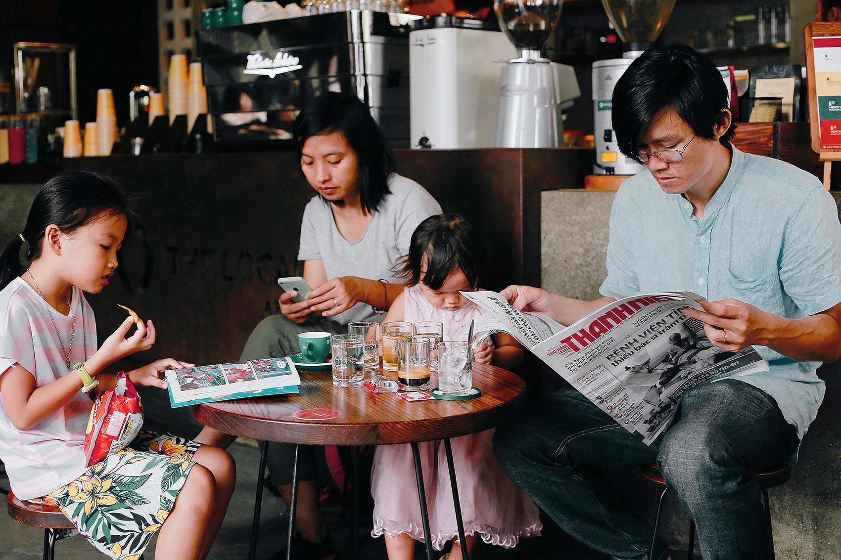
The Local Beans is more than just a coffee shop; it shows the excitement and energy of young people. The Local Beans focuses on promoting the good habits that come with drinking coffee every day. They aim to do more than just serve drinks – they want to bring people together and share positive vibes in the community. The shop has areas that are family-friendly and welcomes everyone. If someone needs a quiet place to work, there are special areas for them, so they can work without distractions. Everything about the shop is designed to show how much they care about the community, making it a favorite spot for many locals.
Drawing from the local coffee culture and extensive lifestyle research, ECH's design strategy focused on the theme of "Local." They crafted a logo that was a minimalist take on a coffee bean.
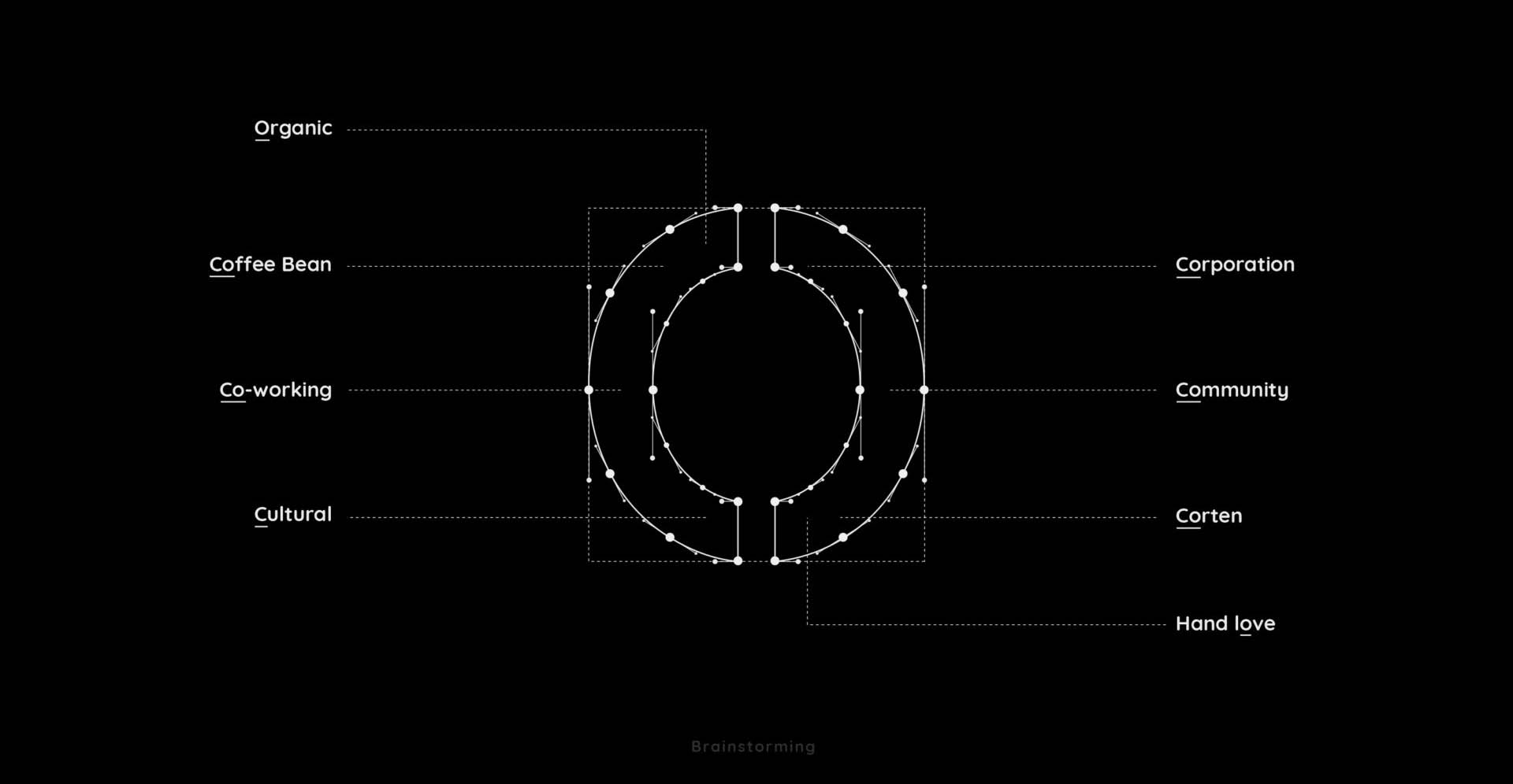
Additionally, they cleverly used the hieroglyphic representation of "C" for Coffee and added symbols that highlighted community and culture, making the logo not just a visual but a symbol of the brand's values.
The chosen color palette further reflected the brand's spirit. The calming red symbolized their passion, teal represented relaxation, and a mature yellow brought depth. These colors ensured the brand was both distinctive and familiar. Today, this refreshed identity is evident across all The Local Beans touchpoints. It not only adds value to their coffee business but also stands as a testament to their commitment to the Danang community.