One School One Library
NON Library new logo and visual identity
Brand New

No items found.
No items found.
No items found.


Established in 2023, NON emerged from the collaboration between The Lab and Tủ Sách Giải Trí & Giáo Dục, with support from partners like Arkki, 6A, and Tbd Construction, to transform library spaces in Vietnam's rural schools. This not-for-profit initiative aims to foster environments where children can explore reading, playing, and creating. At the heart of NON's mission is a vision where everyone can contribute a deployable "library" to any school within their network, ensuring these multifaceted spaces reach every corner of the country and support a broad spectrum of learning and creativity.

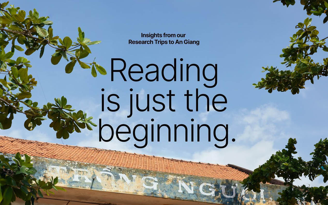
A crucial research trip to a small school in An Giang served as the impetus for NON because it revealed that students use libraries for much more than just reading. This insight into the diverse needs of students—from meeting and playing to advanced self-taught skills—shaped NON's approach to designing libraries as versatile spaces that encourage various activities, including learning and creativity.
What distinguishes NON begins with its adaptive design philosophy, eschewing one-size-fits-all solutions for scalable, adaptable library designs tailored to the unique contexts and needs of each school. This approach not only enriches the functionality of library spaces but also fosters a more inclusive and stimulating learning environment, laying the groundwork for lifelong learning passions. Following this, NON's distinct brand identity further sets it apart, encapsulating its mission through a seamless blend of visual and verbal communication. This strategic identity enhances NON's visibility and cultivates a sense of belonging and shared purpose, attracting broader support to its cause.

At the heart of this identity is a logo that features a symmetric outline design of hands nurturing a flower, symbolizing care, growth, and the flourishing future of children. This imagery aligns seamlessly with NON’s dedication to creating spaces where learning and creativity thrive. The illustration, combined with the custom-designed 'NON' typography, with its playful yet refined style, crafts a memorable and effective logo for the initiative. Additionally, the chosen color scheme highlights NON's distinctiveness, with a vibrant green serving as the brand's signature color and warm orange, soft blue, and pink as secondary tones.

Interestingly, NON introduced a set of illustrations closely mirroring the logo's style, featuring hands with charming, lively eyes. This creative twist is a highlight of their brand identity, making it exceptionally engaging. These illustrations go beyond aesthetic appeal; they effectively aid in communicating the brand’s ideas and values. Moreover, they enrich NON’s identity with a unique character and personality that stand out.

Together, these elements not only shape NON's aesthetic but also ground its narrative, welcoming community engagement and support on this quest. As NON grows, its brand identity continues to be a cornerstone, underpinning its efforts to enhance school library spaces throughout the nation. This dedication to development and adaptability promises that NON's efforts will keep offering invaluable resources and opportunities for children in rural settings, leaving a meaningful mark on their educational paths.

In sum, The Lab's efforts with NON branding, demonstrate how non-profit endeavors can stay contemporary and appealing through minimalist design and effective communication. This instance shows the strength of thoughtful branding in drawing support and encouraging community participation. As NON moves forward on its quest, its strategy offers a beacon of inspiration for similar initiatives, heralding ongoing innovation and positive educational evolution.


