
In 2014, a significant development in Vietnam's children's milk market emerged with the introduction of KUN by International Dairy Products (IDP). This launch marked a new chapter in nutritional approaches, as KUN uniquely blended education with entertainment, setting a new standard in the industry. The brand’s identity was heavily anchored in its animated series, captivating children across the nation and fostering a deep emotional bond between them and the KUN brand.
Since its inception, KUN's innovative branding and marketing strategy, which combined engaging animated series with educational programs, carved out a distinct niche in the Vietnamese children's nutrition sector. Programs like "Kun Stronger," "Kun Environmentalist," and "Kun Better" were not just about storytelling; they were instrumental in imparting valuable life lessons, resonating deeply with their young audience and setting KUN apart in the market.

However, as the digital age advanced, capturing the attention of the new, tech-savvy generation became increasingly challenging. In response, 2023 marked a pivotal year for KUN, as it embarked on a revolutionary path with the help of M — N Associates. This path led to the creation of "KUNIVERSE," a concept designed to realign the brand with the interests and digital explorations of modern children.

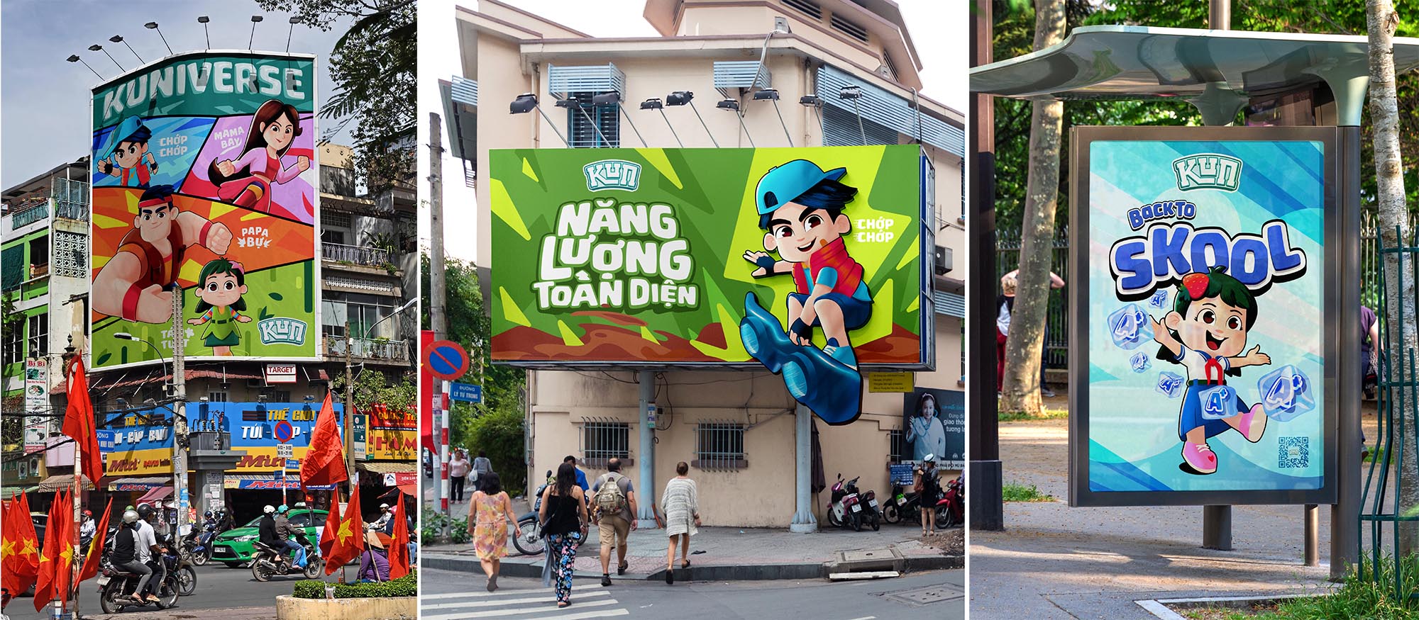
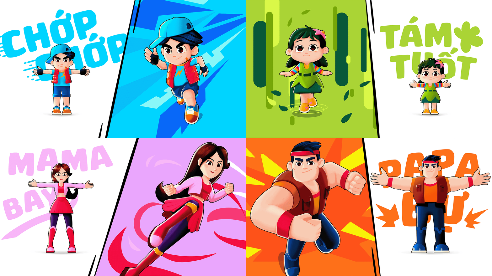
The KUNIVERSE concept was at the heart of KUN's comprehensive brand refresh in 2023. This strategic overhaul involved not just conceptual changes but also tangible ones, such as updates to the logo, typography, and the introduction of newly designed characters. This rebranding aligned KUN with the digital world's vibrancy and dynamism, positioning it as a forward-thinking brand in the children's nutrition industry.

Part of this brand refresh was the subtle yet impactful redesign of the KUN logo. The new logo adopts a flat design, enhancing its versatility across various platforms and contexts. Complementing this change was the adoption of a fresh color palette, featuring shades of light blue and light teal, reflecting a contemporary, youthful vibrancy.

The introduction of the MN KUN font was another crucial aspect of the brand's transformation. This font, inspired by the spontaneity and authenticity of children's handwriting, added a personal touch to the brand, making it more relatable and appealing to its young audience. The choice of typography played a significant role in enhancing the brand's connection with its consumers.

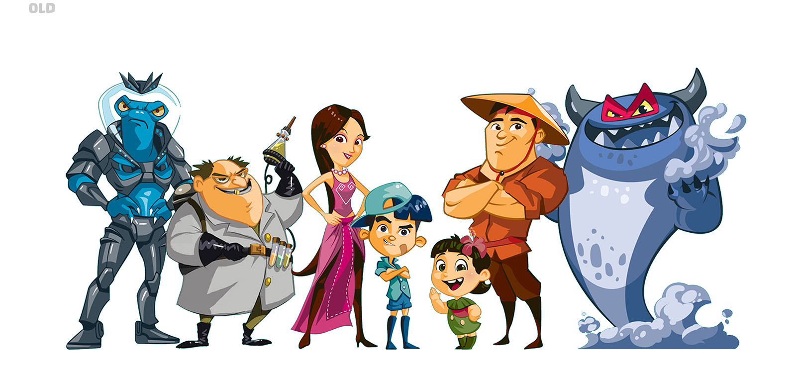
A visionary leap in character design accompanied these branding changes. The characters of the Kuniverse were reimagined with enhanced depth and detail, set against digitally-rich environments that resonated with the preferences of today's children. This redesign was not just about aesthetics; it was about creating characters that could seamlessly blend into the evolving digital landscape.
The dynamic assets of KUNIVERSE extend beyond visual redesigns. In collaboration with Madlad Figures Lab, KUN introduced live-action figures of its iconic characters, transforming the brand experience into an interactive and tangible journey. These figures were more than just collectibles; they were educational tools that brought the KUNIVERSE to life, making learning immersive and fun for children.
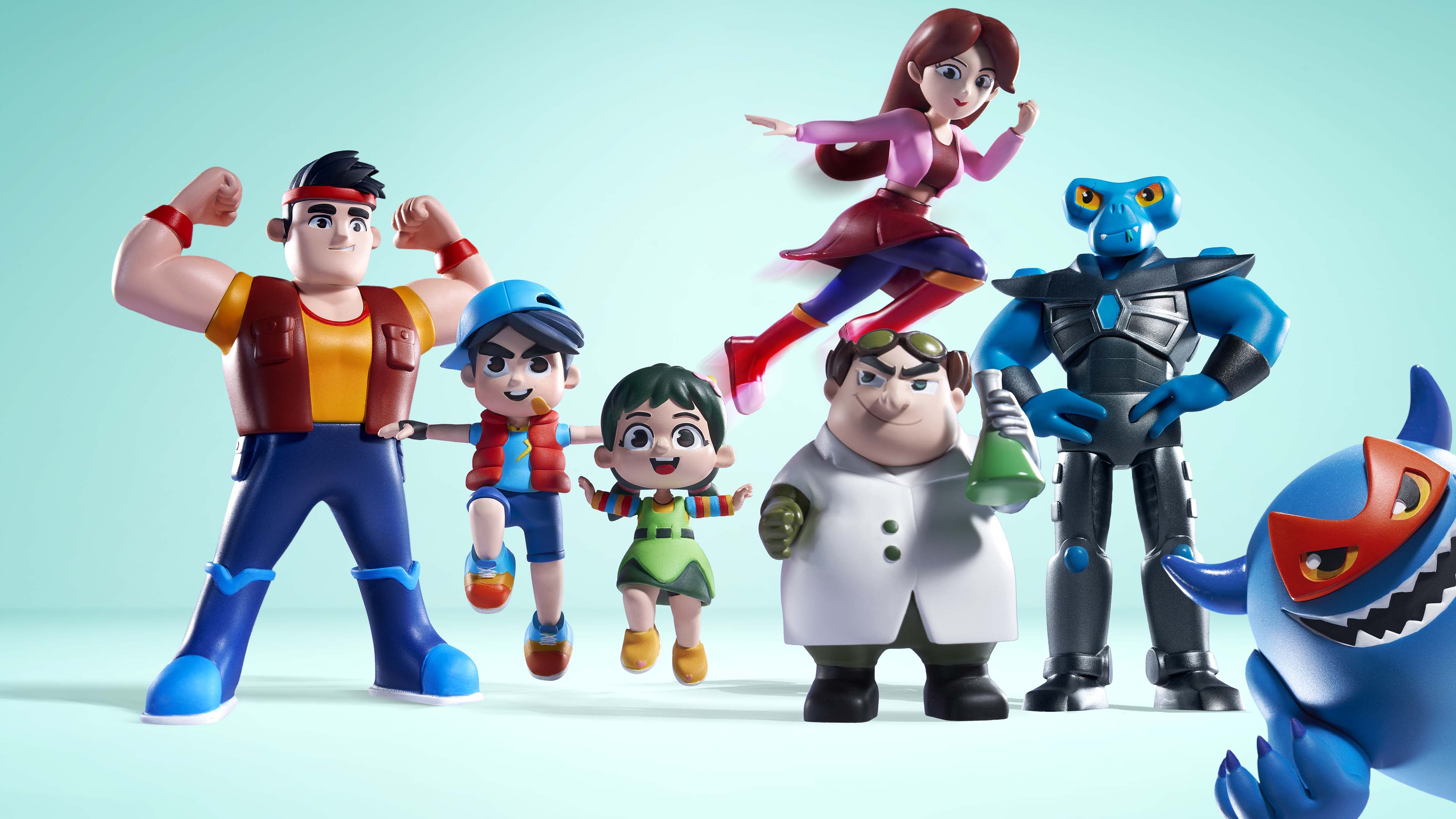
This revitalized approach was aimed at resonating with the digital-savvy youth of today, infusing the brand with a sense of excitement, vivacity, and modernity. Every touchpoint of the brand was carefully crafted to invite children into an exhilarating, immersive journey through the reimagined KUNIVERSE, ensuring that each interaction with the brand was memorable and engaging.


Kun Milk's journey since its inception in 2014 is a testament to a brand that has adeptly adapted to changing times and preferences. By continuously innovating and embracing digital advancements, Kun Milk has maintained its position as a beloved and progressive leader in Vietnam's children's nutrition sector. Through its commitment to blending entertainment with education and its embrace of the digital world, Kun Milk continues to nurture not just the bodies but also the minds and imaginations of children.

