A Brand Built on Fun, Flavor, and Bulldogs
BoBaPoP tea bar latest logo and visual identity
Before
After
No items found.

No items found.
No items found.

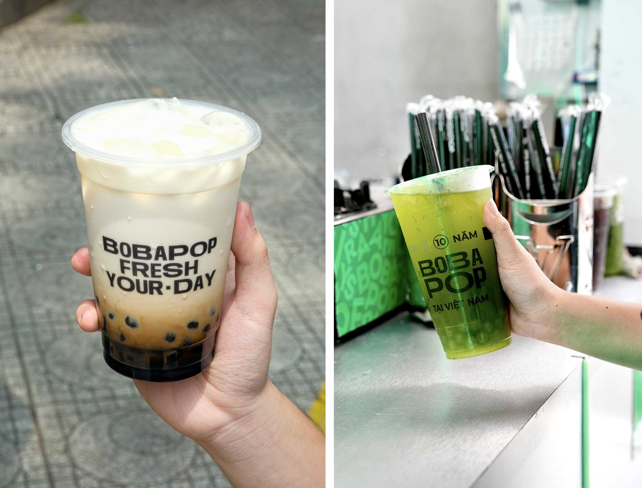
Bobapop – Taiwan Lattea was established in Vietnam around 2013 and has since become one of the most recognizable names in the milk tea market. Inspired by Taiwanese tea culture, Bobapop built its identity around a bold, black-and-white visual style and a quirky French bulldog mascot. With a focus on customizable drinks and a youthful atmosphere, the brand expanded quickly across major cities such as Hà Nội and Hồ Chí Minh City, eventually reaching dozens of locations nationwide, including newer markets like Long Thành and Mỹ Tho. By 2016, it had grown from just a few shops to over 35 stores, with ambitious plans for continued expansion.
In August 2024, a noticeable shift occurred in Bobapop’s brand visuals — not through a formal rebrand, but through a more organic, gradual refresh. While the original look and mascot remained, new design elements began to appear: brighter color palettes, more playful typography, collage-inspired graphics, and a more engaging tone across social media. These updates didn’t replace the old identity but lived alongside it, allowing Bobapop to experiment with a trendier, more vibrant style while retaining its core brand recognition. A year later, this evolved aesthetic is still in use, signaling that the refresh was both intentional and well-received.
What makes Bobapop’s evolution noteworthy is how subtly and effectively it stayed in tune with its audience. The refreshed visuals feel more aligned with Gen Z sensibilities — colorful, expressive, and social-friendly — helping the brand strengthen its emotional connection with younger consumers. At the same time, its familiar logo and character keep it grounded in its original identity. By blending old and new, Bobapop demonstrates how a brand can stay relevant through careful visual updates that enhance, rather than disrupt, its core personality.